![]()
UHI Accessibility Standards
Introduction
On 23 September 2018 regulations on the accessibility of websites and mobile applications of public sector bodies came into force in the UK.
There is a government compliance audit process to ensure that institutions are complying with the new accessibility legislation. The audits are carried out by the Central Digital and Data Office (CDDO).
Accessibility legislation covers all web hosted digital materials, even if they are on the Intranet or in the Virtual Learning Environment (VLE), Brightspace.
UHI's accessibility minimum standards for digital learning and teaching content, were approved in 2011 as part of the Blended Learning Standards. The UHI accessibility minimum standards cover Animations, Audio, Colour and contrast, Images, PDF files, Pictograms, icons and symbols, PowerPoint files, Tables and figures, Table of contents (toc), Videos and Word. These standards have now been updated to include additional items such as captioning, transcripts and HTML (compliance with WCAG 2.1 AA) and have been incorporated into this learning artefact 'UHI Accessibility Standards in digital content'.
Who does this apply to?
These new UHI standards apply to all UHI and Academic Partner staff, not just learning and teaching staff. Non-teaching staff produce many public or student facing documents, handbooks, promotional videos, websites and other material, so it is important that UHI is consistent with digital accessibility across all facets of the institution.
Accessibility statements
Do I have to write an accessibility statement?
Currently you do not have to write an accessibility statement for your content.
If any of your current learning materials are not accessible, you should alert students in your module introduction and/or handbook. If you are making substantial edits to these resources, you will need to ensure that the new version is accessible.
All new core learning materials must be accessible.
If it is not possible for your core learning materials to be accessible, you must provide an accessible alternative. In Brightspace, Ally will help you do this.
Accessibility in digital content
In recent years the removal of barriers in online learning has become a key factor for anyone developing digital learning material.
Typical barriers include:
- Auditory – deafness, hearing impairments;
- Visual – blindness, partially sighted;
- Cognitive/intellectual/developmental - dyslexia, memory impairment;
- Physical – muscular dystrophy.
Government guidelines
When developing learning material in an online environment, the detailed Government Guidance: Understanding accessibility requirements for public sector bodies on the Public Sector Bodies Accessibility Regulations 2018 is a core resource.
The following pages provide information on how you might make reasonable adjustments to your teaching resources. Note: even if you only intend to distribute print copies of your resources, the original digital resource should be in an accessible format.

‘Barriers’ by colinloganremuz [Jack The Ripper] from Flickr, used under an CC BY-NC-SA 2.0.
Colour and contrast
Users who have a colour deficit are unable to distinguish between specific colours. As we age, our eyes are also not so easily able to differentiate between colours and we need higher levels of visual contrast.
Colour
| Topic/issue | Action | Comment |
|---|---|---|
| Use of colour in documents | Ensure that you do not use colour alone to convey meaning. For example, you might use a specific colour with a specific shape to convey meaning. | Visit the Vischeck website with color vision simulator examples to experience the effects of visual impairments. |
| Colour blindness | Use colours that can be distinguished by those with colour blindness. |
Contrast
| Topic | Action | Comment |
|---|---|---|
| Text and background colours | Ensure that there is sufficient contrast between text and background colour. | To check if the colour contrast is sufficient for those with colour deficiencies or for those working with low resolution monitors, print your pages in ‘grayscale’. Visit the web links below for more information and good examples for effective colour contrast in digital content. |
- Colour contrast checker
- WebAIM: Visual Disabilities
- Vischeck: Color vision simulator examples
Images
Images can be used to convey information that is difficult to convey by text alone. They can assist those with dyslexia and others who have problems processing written information. Images can also add interest to learning materials. For those who have difficulty reading images, however, you need to ensure the same, or similar, information is conveyed in, for example, a text file that is easily accessible to someone using a screen reader.
What constitutes an image?
Photographs, drawings, paintings, diagrams, equations, formulae, notations and symbols are all examples of images.
| Topic/issue | Action | Comment |
|---|---|---|
| Size |
|
|
| Alt text | Add alt text to all images. |
Ensure that the text describes the purpose of the image clearly and succinctly. For more information and guidance on how to add Alt text and/or how to mark an image as decorative, visit the UHI Accessibility basics: Microsoft Word guidance and Make your Word documents accessible to people with disabilities. Note: if the image is fully described in the text, do not add Alt Text and mark the image as decorative. For more information, visit Image Description - When to Describe. Do not use Alt text for complex descriptions, it is best practice to summarise complex images in the text. |
| Long descriptions | Add a long description/HTML tag for images conveying complex information. |
For more information, visit the WAI's tutorial on Complex Images. |
| Captions | Use in Word, PowerPoint etc. | For more information and guidance on how to add captions, visit the UHI Accessibility basics: Microsoft Word guidance. |
| Charts and diagrams | Ensure you have a good colour contrast. | Check by printing in ‘grayscale’/black and white. Visit Print in black and white for further information. |
| Colour and contrast | Visit section on colour and contrast. |
Further information
- UHI short guide to creating accessible Word documents: Accessibility basics - Microsoft Word
- WebAIM: Creating Accessible Images
Microsoft Word
Microsoft Word (text) documents are one of the most widely used formats for learning materials. To ensure that you are providing equity of experience for all your learners, you must follow the accessibility guidelines below.
Following the guidelines will also make it easier for you to create a table of contents and convert your document into an accessible PDF format.
| Topic/issue | Action | Comment |
|---|---|---|
| Title, headings and document formatting. | Use the Word styles and formatting toolbar to format headings. | This helps everyone to navigate your document. |
| Page numbers | Number all pages. | Insert page numbers |
| Font |
|
For FE use your College designated font For HE and all university documents use Arial or Calibri |
| Table of contents | Insert this based on Word heading styles. | This provides content information and enables users to move quickly to relevant areas. |
| Bullet points and numbering | Use to lay out information clearly. | |
| Images | Visit section on images. | |
| Hyperlinks | Do not use ‘Click here’ – this may be incomprehensible to those using a screen reader. |
Hyperlinks must make sense as screen reader users often tab from link to link to get an understanding of the page contents. Imaging how difficult understanding the page is if all they hear is “Click here”, “Click here”, “Click here”. But links should not be too long either. Example: Visit our UHI Accessibility page to find out more. |
|
If the document is to be online and printed, prepare a second document with full hyperlinks in brackets for printing. |
Example: Visit our UHI Accessibility page (https://myuhi.sharepoint.com/sites/uni-ad-06) to find out more. Don’t forget to remove the hyperlink in the printed version to remove the underlining. |
|
| Add a screen tip with explanatory text. | This assists those using a screen reader. | |
| Figures | Include figure numbers and captions. | Visit section on tables and figures. |
| Tables | Include table numbers and captions. | Visit section on tables and figures. |
| Charts and diagrams | Provide a content summary. | This should describe key information. |
| Symbols | Where appropriate, use words rather than symbols. | For example: copyright rather than ©. |
| Language | Add the language to the document. | This ensures that screen readers know the language of the document. This is required if the document is converted to a PDF document. Instructions: Accessibility basics: MS Word. |
Further information
- UHI short guide to creating accessible Word documents: Accessibility basics - Microsoft Word
- WebAIM: Microsoft Word - Creating accessible documents
- Microsoft: Making your Word documents accessible
PDFs
A PDF file is a type of file format that enables a document to be presented in the same format as the original. It can be read by anyone who has a PDF reader installed on their device. For example, Adobe Acrobat Reader is a popular free program.
It is possible to save a Word file as a PDF file. If you do this, make sure that your document is properly formatted in Word first. For more information and guidance, visit the UHI Accessibility basics: Microsoft Word guidance.
See the section on PDF creation for more information on how to create learning materials in PDF format.
| Topic/issue | Action | Comment |
|---|---|---|
| Styles in your Word document | Ensure you have followed the checklist guidelines for Word | If the original document is properly formatted in Word, formatting should be carried over to the PDF. If it is not properly formatted, in Word, clear the existing formatting and apply language, heading styles etc., before saving in PDF format. |
| In your Word document select to save it as a pdf file | Save the file as a PDF file. | In the ‘Save as ...’ window select Options and then the following:
|
| Graphics and images | See the section on images. | |
| Navigation | Use bookmarks as required. | Bookmarks help users navigate a document. |
| Tables | See the section on tables. | |
| Document Properties settings | Set:
|
See Accessibility basics MS Word for the language specification. |
Further information
- WebAIM: PDF Accessibility
- Adobe help: Creating accessible PDFs
Scanning
Scanning a document usually creates an image of a document. This means that people using screen readers cannot access the content unless you write a descriptive summary. This is time consuming, for example, reproducing a book chapter, but there are easy solutions which make many documents accessible.
HE
You may not scan books or journals. If the item is available in digital form in UHI’s library, you must provide a link to that item.
If the item is not in digital form in UHI’s library, you must link to material in the CLA digital content store. Digital Content Store material is accessible, the process is easy, and ensures that you comply with the HE CLA licence. You complete a form and UHI’s CLA compliance officer will give you the link. Visit Adding Material to the Virtual Learning Environment - for HE materials only. This page also has a link to Library chat (Ask UHI library staff). Library chat is available during term-time, Monday to Friday 9am - 5pm. Your local librarian will also be happy to help you. If UHI does not own a copy of the book or journal article, UHI will investigate buying a copy or purchasing a copyright fee paid copy from the British Library.
FE
If the item is available in digital form in the library, you must provide a link to that item.
If the item is not in digital form in UHI’s library, as there are different FE CLA licences at each AP, it is essential that you consult your local librarian. They will help you with the FE CLA licence and/or Optical Character Recognition (OCR) scanning.
If the item cannot be linked to the library, converted by OCR or linked to the Digital Content Store, then reconsider the format of the item. If it is a diagram for example, can it be redrawn in a digital form? If it is mathematical formulae, can it be re-written in MathsML? MathsML is readable by a screen reader.
If there is no method to make the item accessible and students must access it to pass the unit/module, then you must provide an accessible alternative. Add a short accessibility statement explaining that the resource is not accessible, why it is not accessible and a link to the accessible alternative. You must ensure that students are not disadvantaged, the accessible alternative must provide the same information as the original item.
If the item is supplementary material (i.e., students do not have to access it to be able to pass the unit/module), it must be clearly marked as supplementary material, explain that the resource is not accessible, and direct students to similar accessible material.
PowerPoint
PowerPoint is one of the most popular means of creating a slide show as they can be easily structured and can also contain multimedia. They are not, however, as accessible for people using screen readers.
| Topic/issue | Action | Comment |
|---|---|---|
| Slide layout | Choose an appropriate slide template. | This ensures headings are used appropriately and are displayed in outline view. |
| Styles | Use PowerPoint styles and formatting. |
For body text, use a minimum of 18 points. For titles do not use less than 20 points. |
| Slide content |
|
|
| Video and audio files |
|
|
| Background colours |
|
Visit the colour and contrast section. |
| Animation | Use sparingly and where appropriate only. | Where possible, users should be able to switch off animations. |
| Images | Check your images comply with accessibility requirements. | Visit the section on images. |
| Notes field |
|
PowerPoint slides which make good use of the notes field can be exported to Word. This enables a screen reader to read the content, especially in relation to images. |
Further information
Tables and figures
You will need to ensure that they do not cause accessibility problems for screen readers, Braille printers and for those who have learning difficulties or who may find a tabular layout difficult to follow.
| Topic | Action | Comment |
|---|---|---|
| Row and column headers | Insert these in data tables. | The titles should be clear and concise. Tables should be structured so as to be meaningful and logical, especially for screen readers. |
| Table/figure numbers, captions and summaries | Add these to all tables and figures. | These can be read by screen readers and will help those with visual disabilities and those who have problems deciphering tables and diagrams. |
| Merged cells | Do not use these. | Merged cells can be difficult to read using a screen reader. |
Further information
- UHI short guide to creating accessible Word documents: Accessibility basics - Microsoft Word
- WebAIM: Creating Accessible Tables
- Microsoft: Creating accessible tables in Word
Audio
Audio files can:
- help personalise the learning environment;
- add interest and variety;
- be used to provide feedback;
- convey more than can be conveyed by text alone (intonation etc).
Information that is only provided in audio format is a barrier to learning for those who cannot hear the audio content. You must therefore ensure that you provide the audio information in an alternative format.
| Topic/issue | Action | Comment |
|---|---|---|
| Size | Compress audio files to reduce their size. | This makes files easier to download. |
| Transcript | Provide a transcript–this may be word-for-word or a summary of content as appropriate. | Include a description of the purpose of the audio file. |
Further information
- Excellence Gateway: Defining Hearing Difficulties
- WebAIM: Auditory Solutions
Audio feedback and feedforward
Teaching staff may wish to use audio feedback with their students. It is highly recommended that staff provide students with the option of a written alternative to the audio feedback.
You could hold a poll at the start of the unit/module to obtain student preferences.
Video
Rich information can be conveyed using video. It is also extremely useful for demonstrating dangerous activities, showing processes (especially close-ups etc) and adding interest to your courses.
Those with visual or hearing impairments will need a transcript of the video to ensure that they understand what is happening. This transcript must describe all of the action as well as report the speech.
| Topic/issue | Action | Comment |
|---|---|---|
| Size |
|
Large files may be difficult/impossible to download. |
| Transcript or description | Ensure your videos are accompanied by transcripts and/or descriptions – this could be an audio description. | Where descriptions are needed, be concise and clear. If there is something happening in the video that is not accompanied by any sound, be sure to describe this for those with visual impairments. |
| Format | Select a format that can be used on the majority of computers. | If you are putting your video in a VLE, make sure it will play. |
Further information
- W3C: Making Audio and Video Media Accessible
- Imperial College London: Creating Accessible Video
Captions and transcripts
During the delivery of courses at UHI, staff record a large volume of taught sessions. This increased dramatically with the pandemic response and the continued shift to blended and online models of delivery. The current volume of video recordings would require more than 36,000 hours of proofreading and editing captions. It would thus be a disproportionate burden for staff to proofread and edit captions. In response to this, the University is adopting the following policy, which has been discussed and supported by UHI management.
Policy
Studio or desktop taught sessions should be recorded in Webex. Webex generates a transcript for all videos. The quality of the transcript varies depending on microphone quality, ambient noise, and diction.
Requirement for 100% accurate captions or transcript
There are three occasions where you must provide 100% accurate captions or transcripts:
- If your recorded session is the primary learning object, for example pre-recorded taught sessions, e.g., flipped classroom lectures.
- If you refer students to third party recordings that are primary learning objects.
- If a student’s PLSP specifies their videos must have accurate captions or a transcript.
Note: if there is something happening in the video that is not accompanied by any sound, for example if you show a chart or give a demonstration, this information must be described in the transcript.
View, search, and edit Webex recording transcripts.
Supplemental learning objects
If the video is a supplemental learning object, you do not need to ensure the transcript is 100% accurate provided you do the following:
- Check the transcripts do not provide inaccurate and potentially dangerous information, e.g., if you say, “The dose is 4 to 5mls” and the captions/transcript says, “The dose is 45mls”, such errors must be corrected prior to release of the video.
- You must inform all students that:
- the videos are supplemental learning material for revision or catch up.
- the captions are not 100% accurate.
- You must refer students to an accurate written source (e.g., taught session notes, textbook references) or a glossary.
- the videos are supplemental learning material for revision or catch up.
This policy applies to recording live sessions, pre-prepared recordings, and third-party recordings.
HTML
Within Brightspace, web pages are created in HTML. The Accessibility and the Brightspace HTML editor resource lists the required accessibility standards. The UHI Forge development tool is also covered under this standard.
Staff who create other web pages for teaching need to comply with WCAG 2.1 AA. Visit also Understanding accessibility requirements for public sector bodies.
Table of contents
A table of contents can be easily created in Word documents if you format your headings using the Word styles formatting options.
Including a correctly formatted table of contents will help all users navigate your document more easily. If created using Word heading styles, it will also help those with screen readers navigate your document more easily.
| Topic/issue | Action | Comment |
|---|---|---|
| Table of contents present | Insert this at the beginning of Word and PDF documents. Refer to Insert a table of contents |
A table of contents greatly Improves usability and navigation. |
| Table of contents created using Word heading styles | Word heading styles can be accessed from the Home ribbon > Styles box (2007) or Home tab > Styles box (2013 onwards). | Using Word heading styles adds hyperlinks in the table of contents. Users can then easily ‘jump’ to the relevant part of the document from the table of contents. |
Further information
- UHI short guide to creating accessible Word documents: Accessibility basics - Microsoft Word
Pictograms
Pictograms are often used in online and printed materials as they may:
- be useful to convey key information in a simple, comprehensible pictorial format;
- be used in mathematical and scientific subjects;
- be part of the navigation structure of a Web site;
- indicate the nature of content in materials (for example, a large ‘i’ symbol is often used to convey the fact that additional information is being provided)
Note: if the pictogram is fully described in the text, do not add Alt Text and mark the pictogram as decorative.
Do not use Alt text for complex descriptions, it is best practice to summarise complex pictograms in the text.
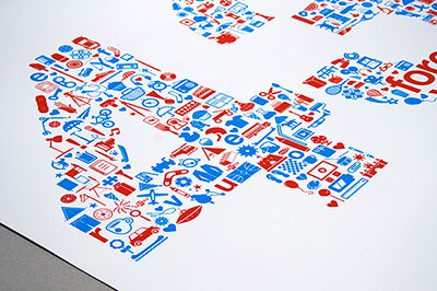
Giffoni Film Festival Poster from Flickr, CC BY-NC-SA
| Topic/issue | Action | Comment |
|---|---|---|
| Using pictograms, icons and symbols | Check the appropriateness of your symbols. | Symbols should be appropriate, readily comprehensible and used sparingly. |
| Scalability | Check that you can enlarge your symbols without losing too much clarity. | Users should be able to enlarge the symbols and they will still remain readable. |
| Colour and contrast | Ensure that you are meeting accessibility requirements for colour and contrast. | Visit section on colour and contrast. |
Further information
- WebAIM: Creating Accessible Images
Animation
Animation can distract people with learning disabilities and may make it very difficult for them to concentrate on other parts of the screen.
Screen readers and Braille displays cannot read information that is animated.
| Topic/issue | Action | Comment |
|---|---|---|
| 1. Using animation | Think about the purpose of your animation. | Is the animation central to the content? If not, it may only serve to distract. On the other hand, it may be that something is better demonstrated by an animation than by text. |
| 2. Provide a description | Provide a description of the animation using text. | Note: if the animation contains key information (for example, an animation of a process) a written version must be provided. |
| 3. Strobe/flicker effects | Avoid these as they may cause seizures in some people. | |
| 4. Optical illusion images | Avoid using optical illusion images where the lines appear to be in motion. |
Specialist software
Staff who use specialist software, e.g., Adobe, Matlab must direct students to the product’s accessibility statement. For example, Accessibility Standards | D2L.
This is particularly relevant to Academic Partner staff who are using specialist software purchased by their partner college rather than UHI.
If the software isn’t accessible, staff must ensure they are able to provide an alternative equivalent prior to using the software. Note: prior to the use of any new software that is not on the Core technologies list, staff must apply for approval of the new software by completing the UHI New Software for L&T and Administration form in the Desktop, Print and Storage section of the UniDesk Self Service Portal.
Accessibility statements for approved non-core technologies can be found on Mahara.
Groupwork
If (as part of group work, for example) students need to their share digital content, teaching staff must consider the requirements of any students with PLSPs to ensure no students are disadvantaged.
If, for example, student videos are to be shared with the group, the accessibility requirements are 100% accurate captions. But this will increase the length of the assessment and could be considered a disproportionate burden.
Another example would be students giving PowerPoint presentations to the class. Teaching staff must ensure that the presentations are accessible to any student with a PLSP and it is the teaching staff's responsibility to make the items accessible, not the students. However, with careful thought and planning, the staff burden could be turned into a positive teaching moment by encouraging students to learn about accessibility as a key graduate/employment attribute.
Staff must ensure that all students can participate in group work.
